Creating the Firesnake.net banner
Origin
On June 22nd 2006, I was talking with FireSnake about her site, after noticing that her colourful WordPress-based blog had been replaced with her old site again, which I found to be monochromatic and plain. I was suggesting methods for designing a new scheme, and had an idea for a whole site design that would suit her. I didn’t preserve the original Photoshop sketch, but it was similar to the following:

I pulled apart an existing Windows wallpaper image of mine to gain the circular effect around Pixelcritter, but I decided that it was not especially satisfactory. Due to experiencing colour space problems (somehow I ended up in a combination CMYK/RGB image) the various shades of red and orange were not coming out correctly. As such, I cannot even be sure that the text is the colour I originally wanted. (The snake is also the wrong colour due to my old display being a long way out of calibration: the snake should be red, not orange.)
The addition of Fire
It then occurred to me that the yellow ring I wanted could be fire. In the style of sheafs of wheat used in many seals, I thought about two jets of yellow flames surrounding the snake. I drew a picture of this in coloured pencil and scanned it in:

This looked good, and we both decided it was the design to use. But producing a high quality rendition of this design would not be easy. The ideal form would be a vector image but I have neither the skill nor the software to generate a digital form of the image. The only other reasonable approach would be to paint it and then scan it in, since only paint affords the necessary vividness and consistency of colour.
I was hoping someone else could paint the fire for us but it fell to me to execute the work, despite not having painted anything in some years. I spent approximately a day on it, from the initial pencil sketch of the flames through to completing the work.
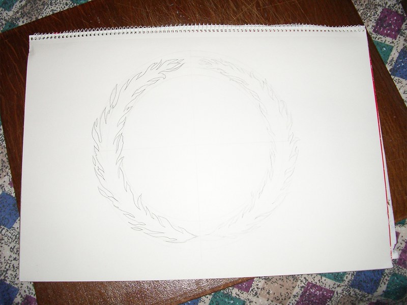
It began life as a series of circles drawn with a compass on a sheet of my old A3 sketch pad, within which I sketched out some flames, roughly at first and then again in darker shade when I was content with the design. The colour was provided by acrylic paint. A series of illustrations of the process are shown below:
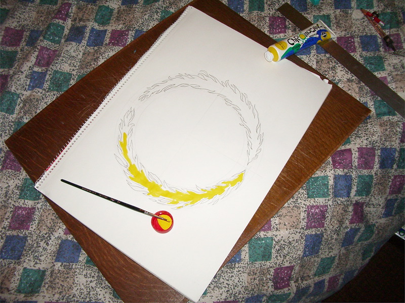
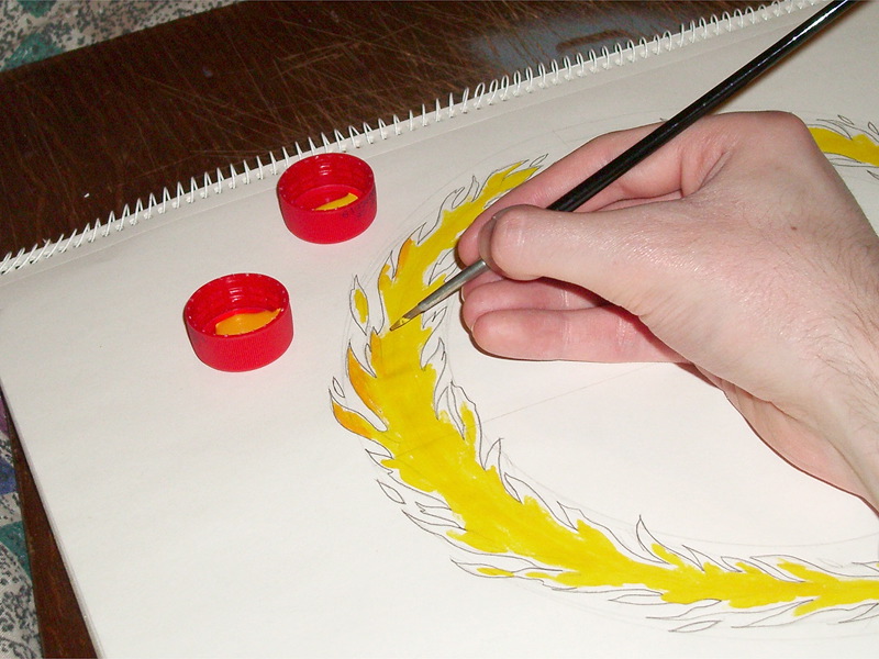

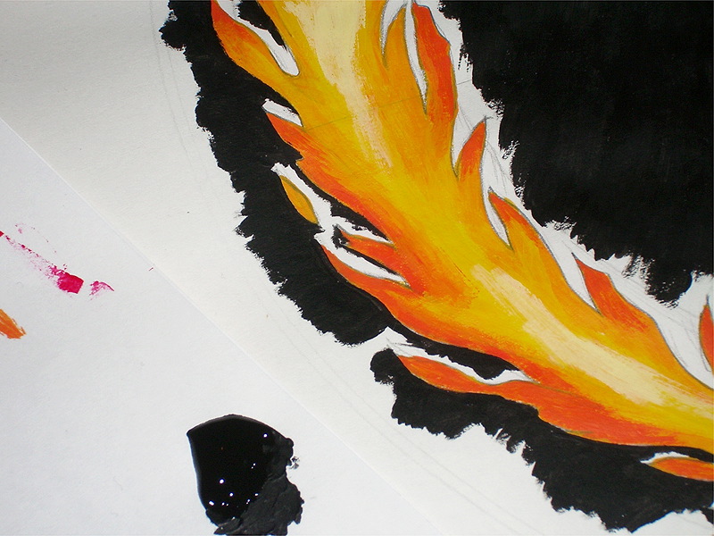
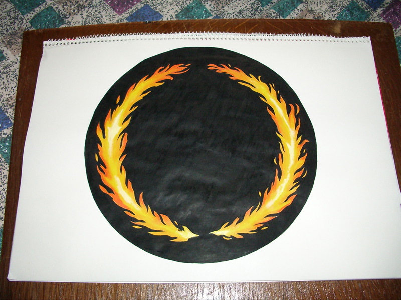
Acrylic paint, as you can see, is not only smooth and reflective, but leaves the paper just a little bit warped!
The final design
Shown below is the final design. The fire can now be seen behind Pixelcritter. I decided to use a purer shade of red for the text, as well as brighten up the colour of the snake itself. The original text used my Java Girl typeface, but to give the banner a more tailored and original style I tweaked the letters quite noticeably. This stage also involved reducing the Photoshop layer effects into regular layers to be substantially tweaked; this included reducing the undesirable aspects of the inner shadow, and limiting the range of the outer glow beyond the control of Photoshop 5. To leave the “.net” part more visible, it itself was tweaked substantially.
Smaller text was also used for the instance of the banner to be used on normal site pages, as well as for the blog subdomain heading. Since Java Girl is a bitmapped font at 16 and 36 pt only, the anti-aliasing had to be removed from the scaled down copies of the text.


The full-size version was introduced later with the intention of being printed on a t-shirt. The original Pixelcritter t-shirt design since has since been updated with the close-up taken from this addition, minus the fire. On enlarging the snake, he finally gained the forked tongue that he had been missing until now. (The large preview above is 50% size; the complete design is 7″ wide at 300 DPI.)
Evaluation
The overall effect of the design is certainly pleasing, at the full size anyway. The fiery nature is clear, and the colours bold and strong. There are two small weaknesses, however. The inner shadow of the text dulls it a little, and getting the right extent of the effect is quite tricky, balancing it between too dull, and too plain. I also find the flames of the fire to be too hard to make out. They look nice in the original artwork, but on a scaled-down image on the screen, they became too small and fine and the edges blur together.
At this stage, however, I am not going to repaint them, and I doubt whether it would even be possible to have modified them if they were a vector image. With a vector image, however, you can monitor your progress at final image size as you go, giving you more chance to keep an eye on your work.
However, FireSnake was most pleased with the outcome, and I don’t suppose anyone will be aware of the flaws. Being a stylised design gives you more leeway, and it can be reasonably interpreted as being a crest designed such that the shape of the flames is meant to be subtle. For now, I will just keep a mental note for the future.