Themes
Caveats
Most if not all pages are just rough notes, and these pages as a whole are far from complete. More notes will be added in time, eventually, maybe.
If, from reading these notes, you conclude that I am off my rocker, you won’t be the first, and you may even be right. These pages may simply position me as an acolyte to the late Gene Ray.
No doubt there are a dozen and one reasons why none of this would ever work, but perhaps somewhere deep down there is a tiny fragment that could be used for something.
Contents
Overview
The appearance of both window content and window decoration will be provided using themes. These are definition sets of all the vector graphics elements needed to draw window frames and widgets. Vector graphics ensure that all display content is fully scalable to any DPI and any text scaling level.
Applications will be “forbidden” (this is restriction that is unfortunately not technically possible in software) from drawing their own custom interface. Applications that wish to have a custom interface must do this by way of shipping a custom theme. The user will in turn be allowed to use this theme not just for the application in question but for the entire system. Conversely, the user will be equally permitted to prohibit an application (or all applications) from using custom themes, to ensure a consistent look and feel at all times. There may end up being some kind of theme inheritance or fallback to accommodate using an incomplete application theme systemwide.
Theme creation needs to be made as simple as possible with a high quality toolkit, otherwise too many application developers will just draw something of their own and bypass the OS theme system outright. The use of vectors will be quite an impediment though.
On the matter of custom themes, Andrew Clover wrote on doxdesk.com:
Please, application authors, leave the skin alone. Use the native OS widgets. If I want a dark theme let me choose a dark theme in the OS and have all the applications respond accordingly. Don't force your questionable artistic taste onto the dialogs and chrome I have to use on a desktop that looks nothing like it. Sure, it makes your application “stand out”. The usual similie for that expression is “like a sore thumb” and it's not considered positive. It only takes a few anti-social self-important skinned applications to turn the desktop into a horrific inconsistent eyesore (left).
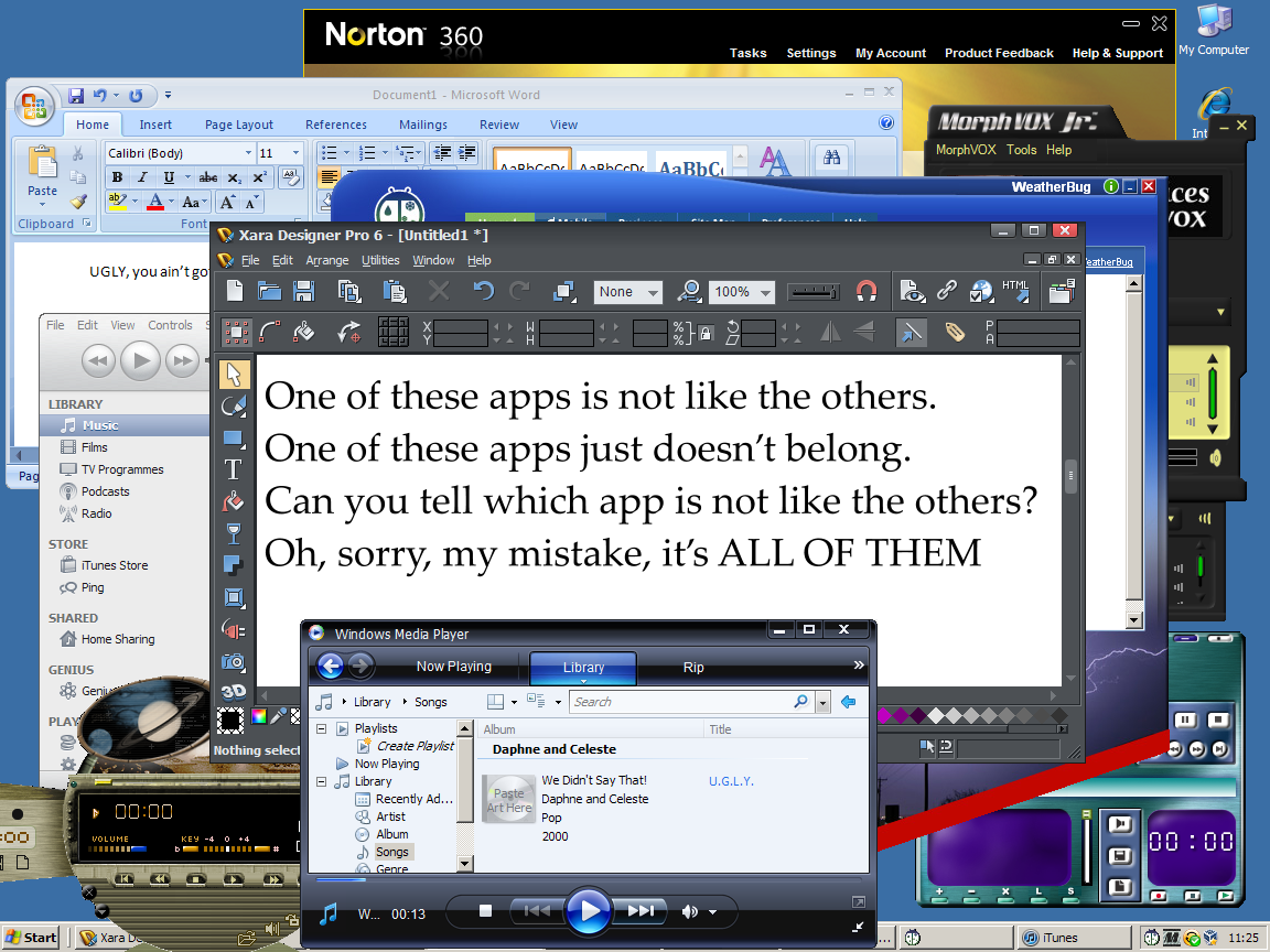
The image is hyperbolic but it illustrates the problem well (and note that two of the applications are Microsoft’s own). When every developer creates a fully custom appearance for their software—a practice that continues to this day—the system as a whole suffers. This is why applications are expected to use the native theme system, allowing users to force applications back to the system standard theme if they value consistency more or need the control that this offers, e.g. to accommodate visual impairment.
The following is a more up-to-date example, from Windows 10:
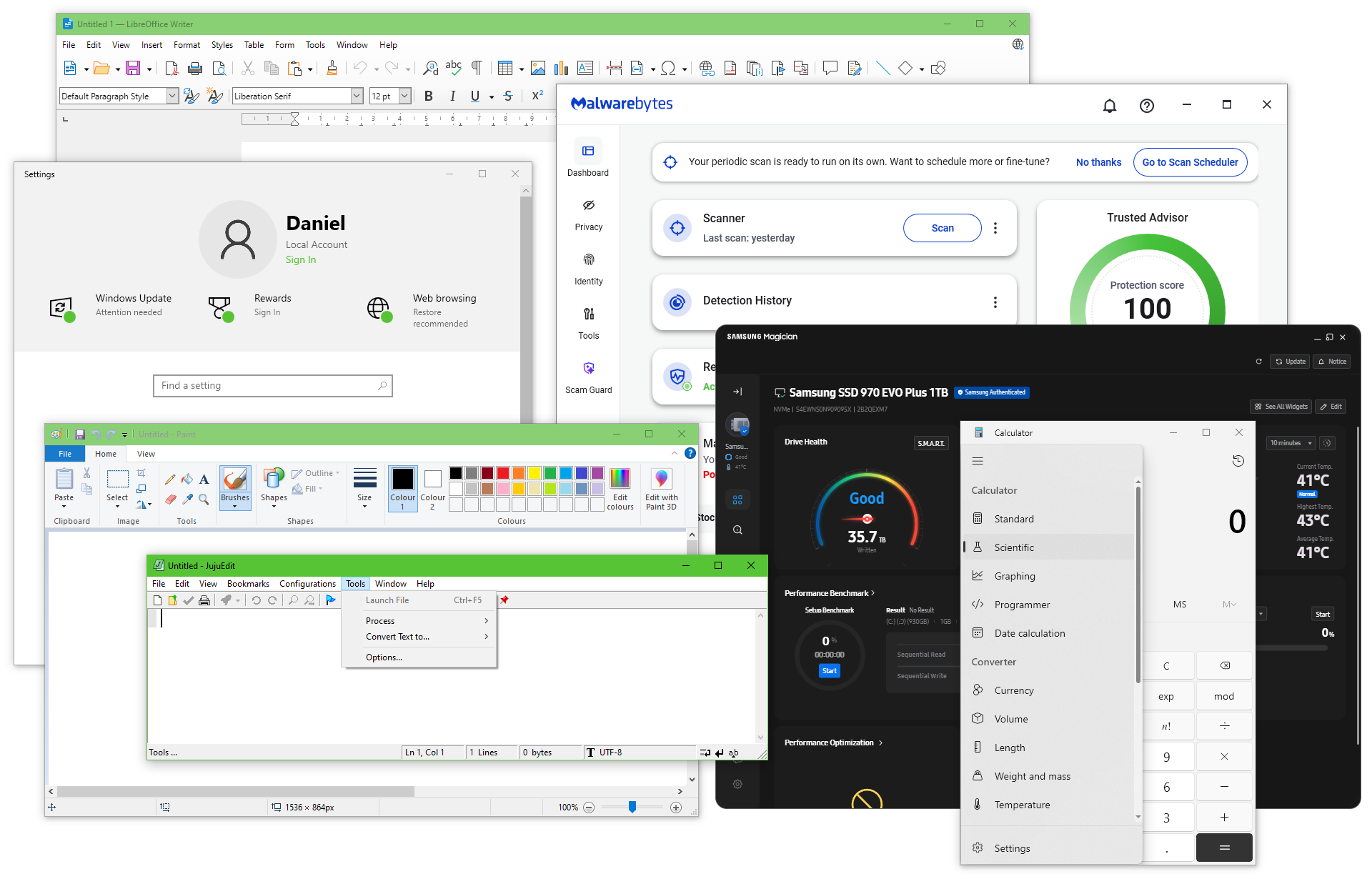
In this example we have:
- Real system menu icons in title bars, a pretend system menu icon (Calculator) and no system menu (the icon in Calculator’s title bar does nothing)
- A window with no shadow (Samsung Magician, fully up-to-date)
- A program running in dark mode for no reason (also Samsung Magician)
- A real menu bar, a fake menu bar (LibreOffice), a side-panel menu (Calculator) and a ribbon UI (Paint)
- Programs with native title bars and simulated native title bars, as well as programs that completely ignore the title bar colour
- No consistency in the presentation of pretty much any part of the UI at all
With Mac OS X, Apple introduced the idea of title bars being solid for focused windows and translucent for inactive windows. For no good reason, all the “metro” applications in Windows 10 and 11 are “translucent” when active, and solid when inactive! (I say “translucent” in that this is not quite true, as what you are seeing through the translucency is the desktop background, not the window below, which is confusing in itself.)
Classification
Themes could have a classification, e.g. “Windows”, “Windows::flat”, “Windows::flat::10” that allows applications to supply multiple options for things like custom title bar buttons, where the per-OS design is unrelated to any other control type (e.g. bare monochrome shapes in Windows vs coloured circles in macOS).
Tiling window managers may only allow themes marked as compatible, such as the one they supply. This is because they expect a very different approach to window presentation than a conventional window manager. This will depend on whether the window manager can be given the ability to selectively block parts of the theme, or to provide special window component definitions that are themed differently. Theme inheritance or fallback would also apply here: the tiling window manager could set the fallback theme to be its own, such that any standard themes that do not accommodate the tiling system will fall back to the tiling window manager’s own theme (mostly for the various title bars and window borders of the window grid). The tiling window manager’s own theme could also give the whole system a suitably minimalistic look and serve as the only theme if desired.
Customisation
The use of vector graphics where possible will allow for colour customisation. Themes will be able to define a set of named base colours which in turn can be customised by the user. This means that the colour model used by the theme engine needs to have suitable facilities for colour transformations and should employ a perceptual colour space (see How software gets color wrong by Björn Ottosson for details). In addition to direct colour blends, there must also be ways to request darker, lighter, warmer and colder forms of colours, as blending to black and blending to white do not work as well, in non-perceptual space at least.